
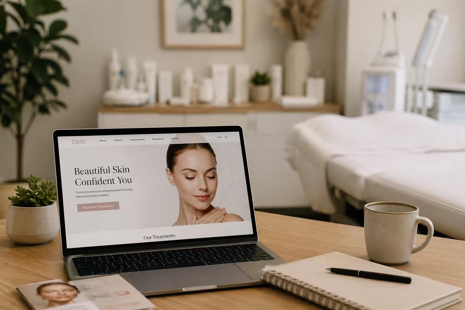

A med spa owner checks her analytics on a Tuesday morning. Three hundred visitors last week. Two bookings. The website looks fine. The photos are decent. The copy reads well enough. And still, almost everyone who lands on the site leaves without picking up the phone or filling out a form.
This is the most common problem in aesthetics and skincare marketing, and it has almost nothing to do with traffic. It’s a conversion problem, not a visibility problem. A skincare or med spa website’s job isn’t to look good. It’s to move a nervous first-time visitor, who is often comparing you against three other clinics in open tabs, into a booked consultation. Here’s what that actually takes.
The Seven Sections Every High-Converting Skincare Website Needs
Skincare and med spa websites that consistently book consultations tend to follow the same structural pattern, in roughly this order:
A hero section with a clear headline and a single, obvious call to action. A trust bar showing reviews, certifications, and years in practice, placed high enough that a visitor sees it before they have to scroll for it. A plain-language explanation of your core treatments, written for someone who has never had the procedure before, not for another provider. A before-and-after gallery (with proper consent and disclosure, covered in next week’s post). A visible pricing range, even if it’s a “starting at” figure, because pricing opacity is one of the fastest ways to lose a visitor who’s price-comparing in another tab. A provider bio with real credentials and a face, not a stock photo. And a genuinely useful FAQ section that answers the objections a nervous first-timer is silently sitting with: does it hurt, how long is recovery, what if I don’t like the result.
Skip one of these and you’re not failing at design. You’re leaving a specific objection unanswered, and an unanswered objection is a closed tab.
Mobile is Where the Decision Happens
The overwhelming majority of skincare and med spa website traffic now arrives on a phone, and that share keeps climbing. If your site was designed on a laptop and merely “responds” to smaller screens, rather than being built mobile-first, you’re optimizing for the wrong device. Mobile-first for a skincare business means the booking button is reachable with a thumb without scrolling past three sections, treatment descriptions are skimmable in short paragraphs instead of dense blocks, and tap targets are large enough that someone standing in line at a coffee shop can book without frustration.
Let Real Results Lead
Lifestyle stock photography of a woman touching her face doesn’t build trust. Real, consented before-and-after results do. Clinics that put actual patient results in the hero section, above the fold, consistently see stronger engagement and more form completions than clinics that lead with mood photography. The lesson isn’t “add more photos.” It’s “let proof lead the page, not personality.” Your results are your strongest sales asset. Bury them below three paragraphs of brand story and you’re burying your best evidence.
(A note on compliance: before-and-after content carries real legal weight under FTC advertising rules and, for medical treatments, HIPAA. We’re covering exactly how to do this correctly, consent forms and all, in next week’s post.)
Booking Software Is the Hinge the Whole Page Swings On
You can have the best design in your market and still lose the booking if the path from “I’m interested” to “I’m on the calendar” has friction. The clearest, most consistent finding across conversion research for medical and aesthetic websites is this: every additional field on a booking form increases the chance someone abandons it. Five fields or fewer is a reasonable ceiling for an initial consultation request. Name, phone or email, treatment of interest, preferred day, done. Ask for insurance information, a detailed medical history, or a novel’s worth of context up front, and you’ve handed the visitor a reason to close the tab and “think about it,” which usually means they don’t come back.
The booking widget itself should live directly on the page, not behind a link to a separate portal that forces a new tab and a login. Real-time availability, mobile optimization, and automated confirmation and reminder messages aren’t luxuries here. They’re what turns an interested visitor into a kept appointment instead of a no-show.
Page Speed Is a Trust Signal
A slow-loading website doesn’t just frustrate visitors, it quietly tells them the business behind it might be similarly slow to respond, slow to confirm, slow to show up. Every additional second of load time on mobile measurably increases the number of people who leave before the page finishes rendering. For a skincare or med spa site carrying heavy before-and-after galleries and video, this means active image compression, lazy-loading anything below the fold, and resisting the temptation to autoplay a background video on the homepage just because it looks impressive on a fast office connection. It won’t look impressive on a client’s phone with two bars of signal in a parking lot.
What “High-Converting” Actually Means for Your Business
Healthcare and aesthetics websites in general tend to convert in the low single digits, with plenty of room to improve. Sites that implement the fundamentals above, real proof up front, low-friction booking, mobile-first design, fast load times, consistently outperform that baseline by a wide margin. The gap between an average skincare website and a genuinely high-converting one isn’t a bigger budget or a flashier redesign. It’s usually five or six specific, fixable decisions, the ones outlined above, executed properly and in the right order.
If your site is getting visitors and not bookings, the fix is rarely “get more traffic.” It’s almost always “fix what happens after they arrive.”
Want a second pair of eyes on your site? MTB Digital offers a free website audit for skincare and med spa businesses, walking through exactly which of these seven elements your site is missing and what to fix first. Request your audit.